You closed my first thread so I’m starting another one.
I spoke with many other Calendly users who I personally know in person and through work, and literally EVERYONE of the think it’s a bad design to not show time display option clearly.
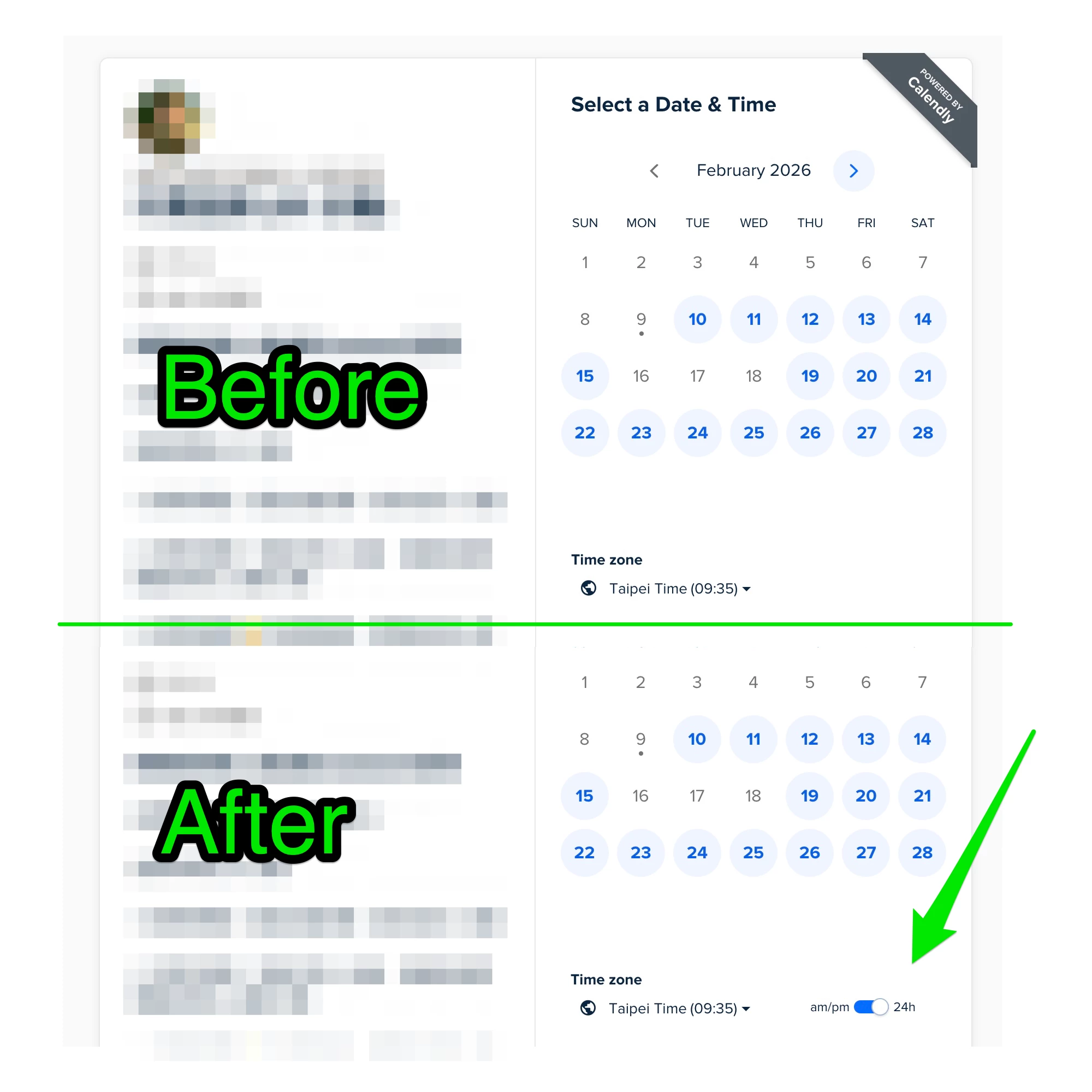
I already said it but here it is again, imo you have two very easy fix:
- Always show am / pm next to the time, regardless of the settings. It just doesn’t hurt to be extra clear.
- Move the “am/pm 24h” toggle outside of the “Time Zone” drop down list so that clients can see it without any action. Just move that damn thing out!! Look at this example below, it literally takes an UX guy 10 minutes to verify and design, and 10 minutes for a junior, heck perhaps an intern to implement! Don’t continue putting this off for no reason.
I have about 3-4 people booking incorrectly PER WEEK because of this because like I said previously, many of my clients are not in the same timezone as I am. To me that’s like 5-10% of people booking wrong. Please, please fix this issue!