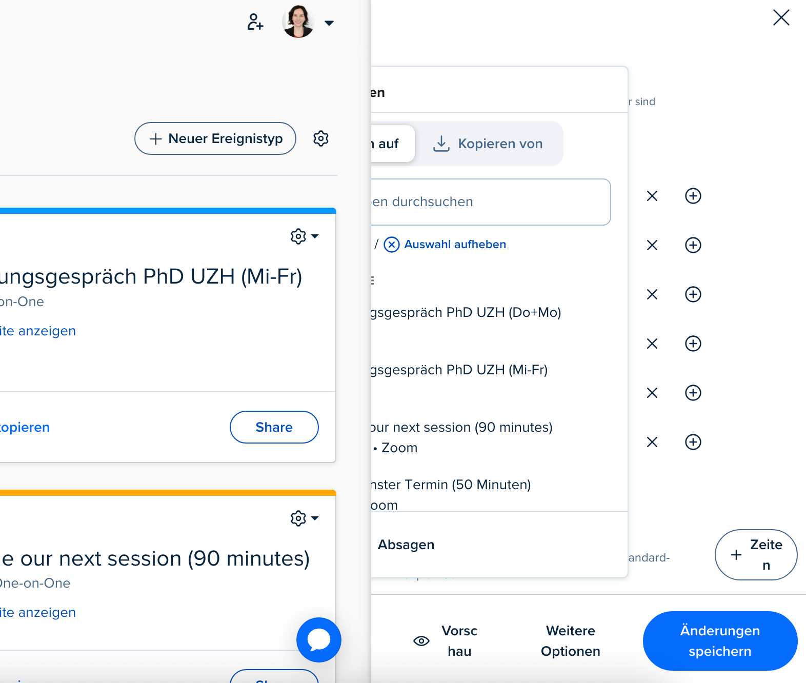
I wanted to share some candid feedback regarding the new calendar layout. Unfortunately, the current design feels like a significant step backward in usability. The entire screen is now cluttered with various event types, and the edit panel on the right is very difficult to navigate—especially with limited space and so many visual distractions.
Previously, having editing tools on the left side or available in a full-screen view made it much easier to focus and manage events efficiently. I strongly urge you to consider restoring the full-screen editing option, or at the very least, allowing users to choose between layout modes based on their preference.
This new interface significantly impacts productivity and ease of use. I hope the team will consider user feedback seriously and offer improvements soon.
Page 1 / 1
Hi @Fatema52348 - Thanks for reaching out.
Really appreciate the feedback here, I’ll get all of this over to our product team to review - We want this to be usable by everyone! Is there any other information you can share? I’d be happy to send that over as well.
Let me know! Thank you
Yes I experienced the same :(
Yes, I also have a thread asking for the same.
Yes, me too! I googled if anyone felt the same. the previous layout was so much better. now i have so little screen space to customize my events and it’s awful
I created a community account just to add visibility here. Horrible design choice, once again making the platform worse instead of better for users. My coworker said she almost threw her computer through the wall trying to make edits in this new layout & I agree with her. Such garbage.
I agree with the above user's statements. I have been with Calendly for over 4 years now and have experienced two interface updates, both were a step backwards. Please just keep the system simple, we don't need it more complicated. I have to re-learn the interface each time, which leads to delays and mistakes. Not good. Now the new systems is the worst one yet, with limited views of the actual important information being modified. Also, can we get a feature that allows you permanently set the time zone?!? Why do I have to “lock” the time zone each and every time I create a new event? Make a feature where you choose a time zone and it is permanently “locked’! Same thing with the booking questions, why do I have to manually modify the standard booking question for each and every new event? Can you not make a way to modify the standard booking question permanently?
This new update is terrible. Please give us the option to revert to the old UI.
I am not sure how you have “updated something” but made everything visually and functionally worse.
You are going to force everyone to find an alternative
HATE the new edit panel on the right. It is so tiny and cramped. Please go back to the old full page view of an event!!!
Yes, what on earth happened? Most of the time, I can’t even properly see all the settings I’m trying to edit. Was this some ex-employee’s revenge after being laid off? Will probably need to switch providers since this is basically unusable now.
Hi @Sylvia24308 - Thanks for reaching out on this one - We’re still taking any feedback on the new update.
Your screenshot is definitely unexpected behavior - Does it do this if you sign in through another Web browser as well? If the behavior still occurs, I would send this over to our support team so they can look further into it.
You can reach out to them through the chat function (Blue bubble) or by emailing support@calendly.com
Hi. Thank you. The screenshot was done in Chrome and the problem was the same in Firefox. I then tried the mobile app, and there the option to copy times from another calendar seems to be gone altogether.
I agree. Please bring the old layout back. Getting the data needed for meetings with multiple attendees is horrible now. Very time consuming and did not consider the user. After the last few days, I’ve settled for searching through email for a clean summary of each sign up.
Thank you Calendly, I’ve strengthened my eye muscles
Hello Calendly,
I just wanted to sincerely thank you for your brand-new interface.
Thanks to you, I’ve developed excellent neck flexibility and a sharp, permanently right-tilted gaze. Spending my days staring at a tiny sliver on the side of my screen is a true visual delight. I assume the goal is to enhance focus intensity. Or maybe to teach us how to live with early-onset neck strain?
I used to have a full, fluid, intuitive overview. Now, it’s “Where’s Waldo?” — SaaS edition: click, guess, hope, repeat. It’s playful, I’ll give you that. Frustrating, but playful.
So thank you for reimagining the user experience around minimalist chaos. You’ve turned a scheduling tool into a zen puzzle: click, breathe, fail, start over.
Looking forward to the day I can see my full screen again,
A user who thought a 27-inch monitor might actually serve a purpose.
Wanted to echo the above. The original Calendly layout was great. The change after was a step down but was still manageable. The most recent update everything is crammed and the interface is not as friendly. Also why do we have to click an additional button to view more options now? Every event we create required details under the additional option menu so that’s now an extra click every time.
As the interface changes we should be given the option to retain or upgrade the layout such as outlook or adobe. We don’t need minimalism, we need functionality.