
This has been brought up before but the thread was closed with no resolution.
Wording
Calendly user = the business owner who registered on calendly to let their customers book appointments.
Customer = the people booking appointments
Let me reiterate the issue.
Many calendly user, me included, service customers in different time zones.
For example, my availability for a certain date might be 3pm and 4pm
but for my customers on the opposite of the globe, they’ll see 3am and 4am.
However, based on Calendly’s current design, the time display depends on the customer’s device setting, and it cannot be customized on the Calendly user’s side.
If the customer happens to use 12hr mode, there won’t be any issue because they’ll clearly see that my available times (3am and 4am) are in the middle of the night for them.
HOWEVER, if the customer uses 24hr mode, they’ll see 3:00 and 4:00 and have NO WAY to know if they mean 3:00am and 4:00am or 3:00pm and 4:00pm without more indicator (where there’s currently none!)
If that days has more available times to choose from , including both am and pm times in the customer’s view, they’ll surely be able to infer from other options on the screen that some times are not suitable, but that’s really a big IF because very frequently there is only limited options for them to choose from.
This has caused me at least 50 incidents in the past year where my customers thought they booked an afternoon appointment while in fact they booked something in the middle of the night for them.
MY SUGGESTION:
- Just let customers choose between 12h and 24h right on the booking screen. That’s a super easy fix and should completely resolve the issue if they’re paying just a little bit of attention when booking.
- Just force displaying AM PM on all the time slots. Sure, they might see 15:00 PM, which is completely fine and understandable in my opinion. Absolutely nothing wrong with 17:30 PM or 22:15 PM.
- If you guys really want to keep your current design (for some reason) and follow the user’s own device setting (even though this is causing everybody lots of pain), at least consider adding a moon icon🌛 or something next to those ungodly hours. I would assume, statistically speaking, most of the time people don’t intend to book 3 AM appointments all that often. A moon icon next to times between 9pm and 6am for example is an elegant and easy solution.
PLEASE DO SOMETHING. You guys are smart enough to create Calendly, this UX issue shouldn’t be that hard for you smart people okay? I’m really tired of reminding my customer on the other side of the globe that they need to pay attention to their device setting to see if they’re booking am or pm appointments… Why is this even needed? Calendly is supposed to help us solve the manual scheduling problem, not creating more problems in the process, right?
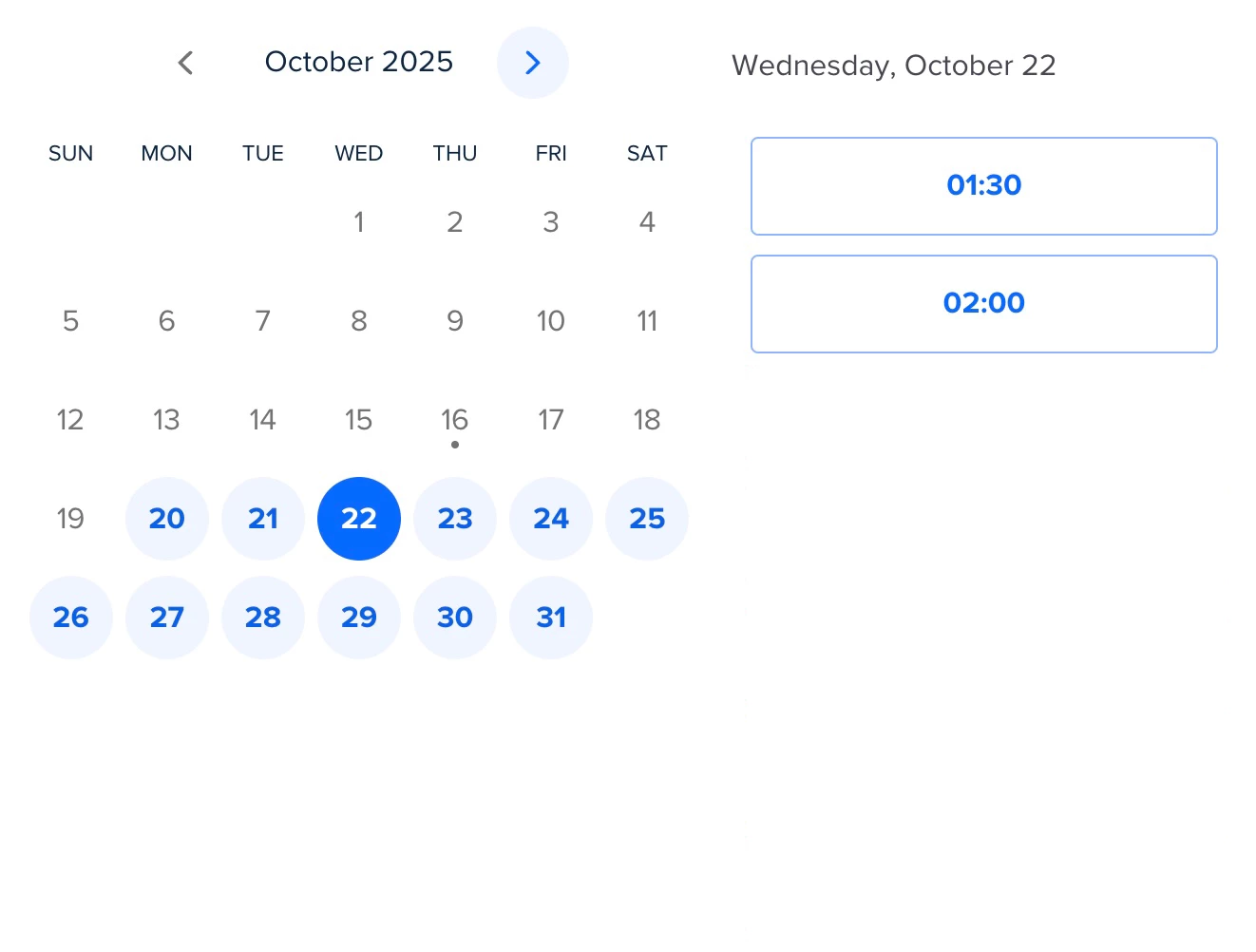
Just look at this sample below. How do you even know if these two choices are 1:30am or 1:30pm from only the information in the image?? There’s just no way! Don’t assume most people to be smart and carefully check these details, because they aren’t, and don’t!