
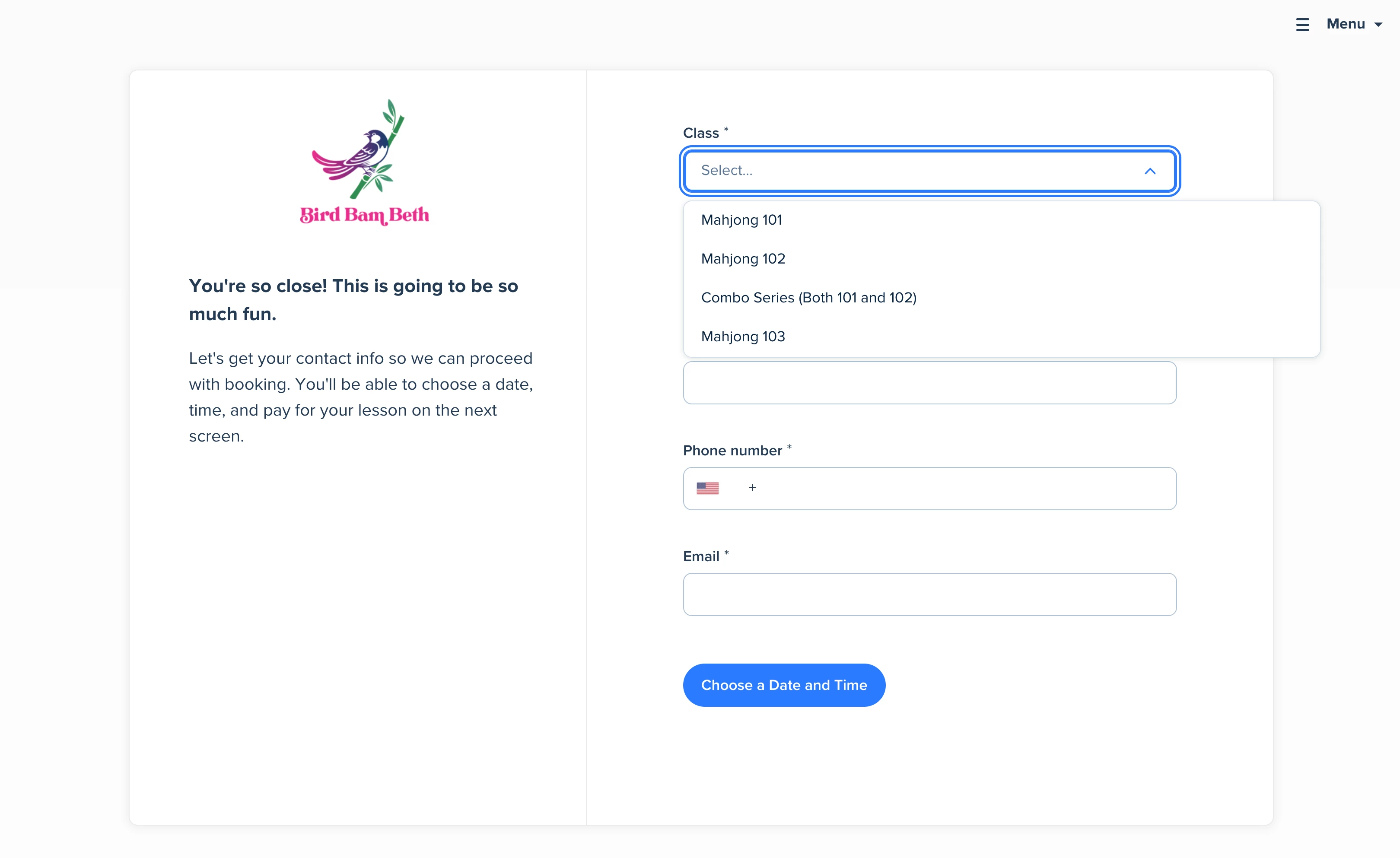
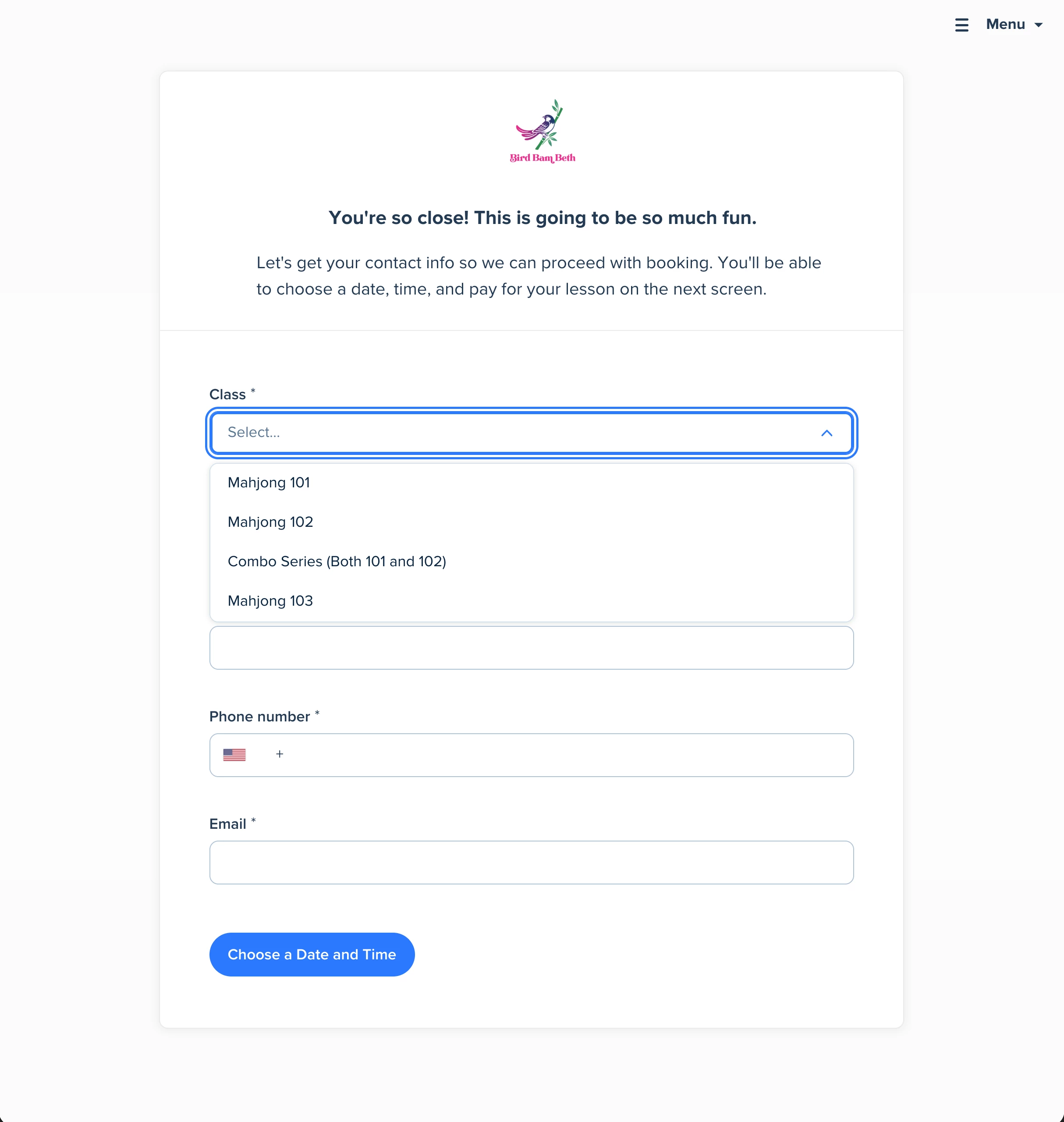
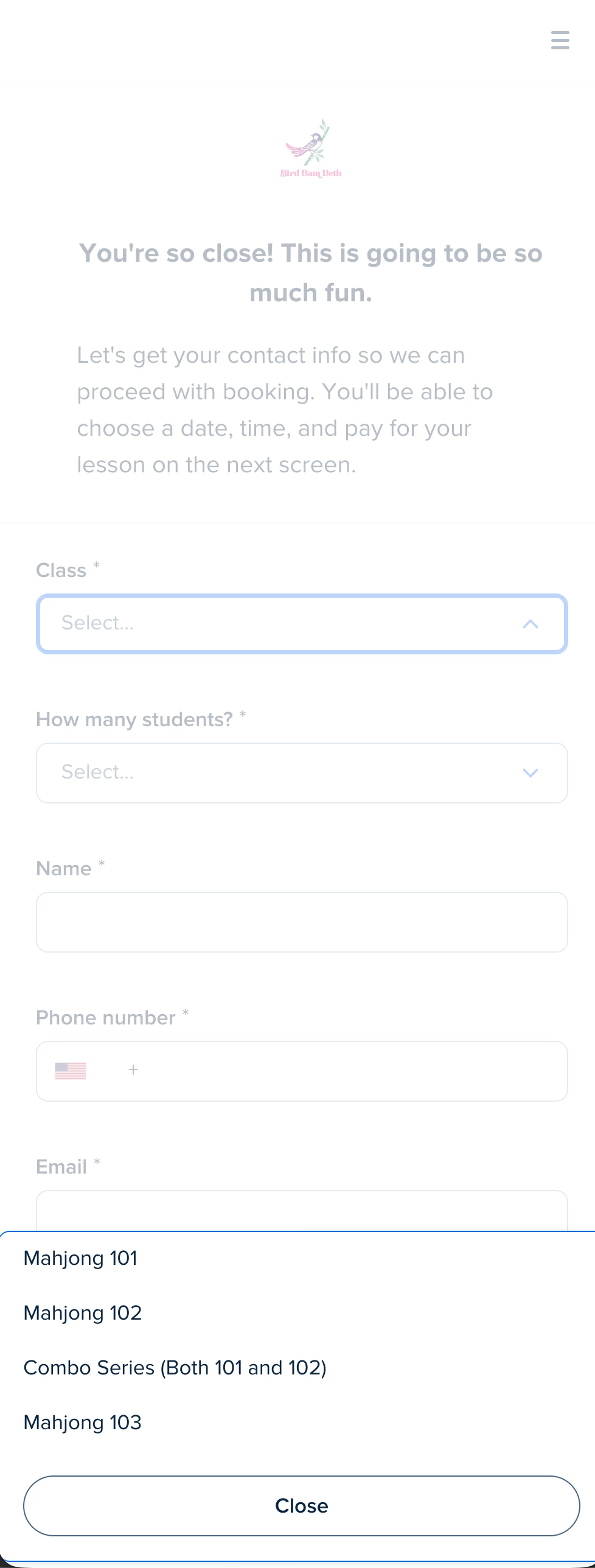
Hi everyone, I created my first routing form recently and noticed that on mobile views—and only on mobile!—the menu that displays your dropdown choices appears at the bottom of the view when the user clicks or taps the field.
This is an extremely non-standard behavior for a very well-defined and established UI paradigm of dropdown buttons where clicking a dropdown field will either expand from the field where the user clicked or in a worst case scenario, pop some kind of modal dialog. Calendly does neither here and confusingly shows the button at the bottom of the page. This should be reconsidered because it’s confusing to users and does not provide any kind of meaningful improvement to the experience.
You can see in my screenshot here that he desktop and tablet-width views both operate in a standard way when clicking the first dropdown menu at the top of the form, so the mobile behavior working like this is also an inconsistency that’s been introduced for no discernible reason. Please fix!
Desktop
Tablet
Mobile