I’ve cruised with the product updates for 5 years now, never commenting when I’ve been bummed by one. Overall, I love Calendly and it makes my business great. I’ve adjusted with any updates. But wow -
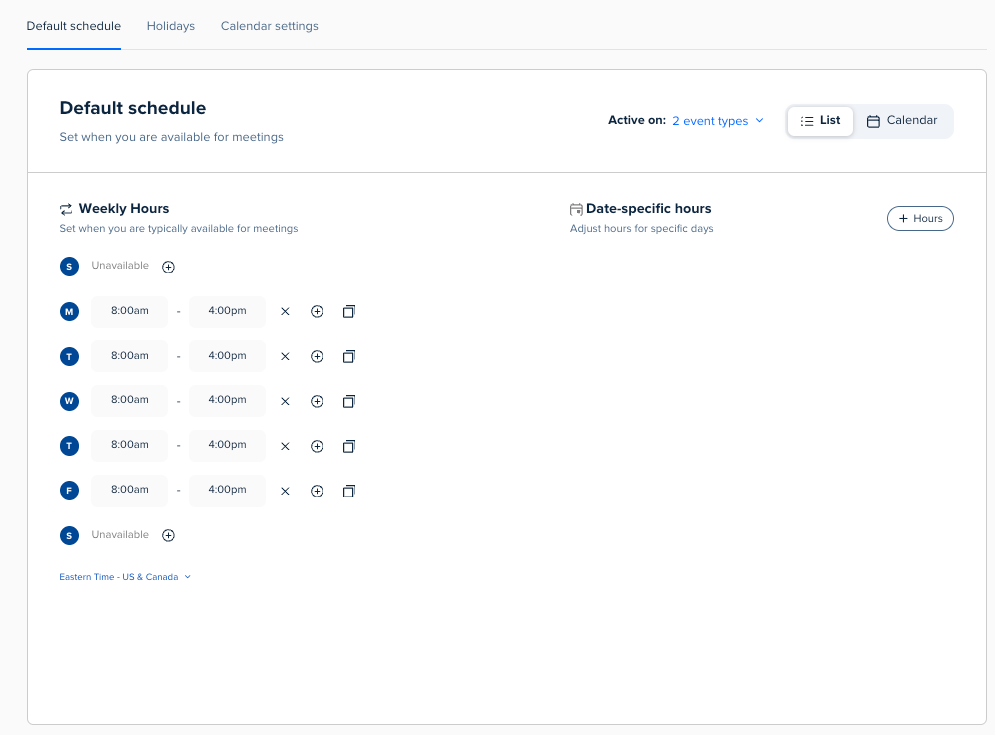
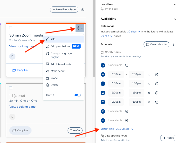
Super, super disappointed in the Availability updates. The user experience is far worse than it was before. It used to be much easier to navigate and change groups at once in a larger screen. I’d love to see the Product team allow for the old experience OR the new one. Having an accessible and visible quick Availability tab on the main page (like it was) instead of only on every single event page would be great. It could remain it’s own separate experience as well as being added to individual events. As someone who schedules 40 calls a week of different types and 2 different lengths, it’s a mess to go into each type and make sure it’s accurate when major travel and schedule changes are occuring for many days or weeks. An absolute huge time suck, which is was not at all before. This is a major product change.