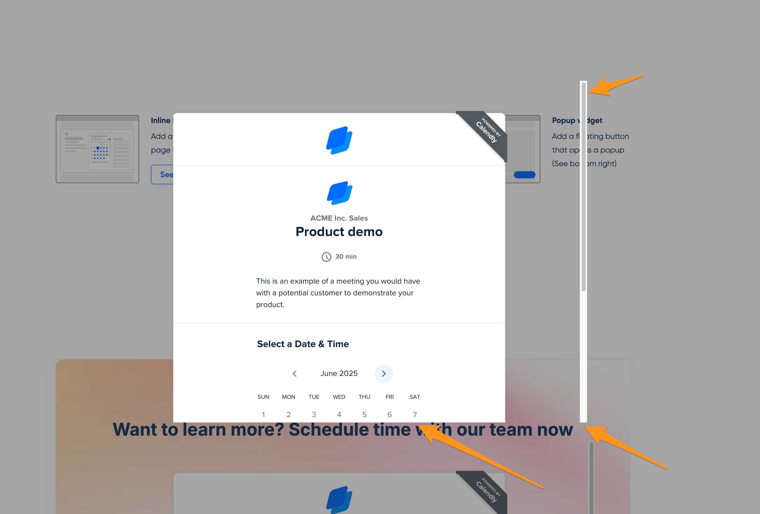
We have used Calendly in the past on other projects and was a fan of their Popup Text popup. It was nicely contained and styled, compared to other platforms. We just switched over to Calendly for another project and were disappointed to see their styles got updated in the last couple of days and now this popup shows an off-putting scrollbar, with half the content cut off. Is this a bug or is this the expected result now?
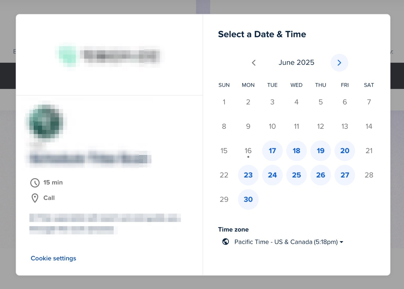
This is what the popup used to look like just a few days ago:

This is what the popup looks like now (Per the demo page):

Need any guidance - if this is the new expected behavior we may have to switch back soon. Thanks for any feedback.


