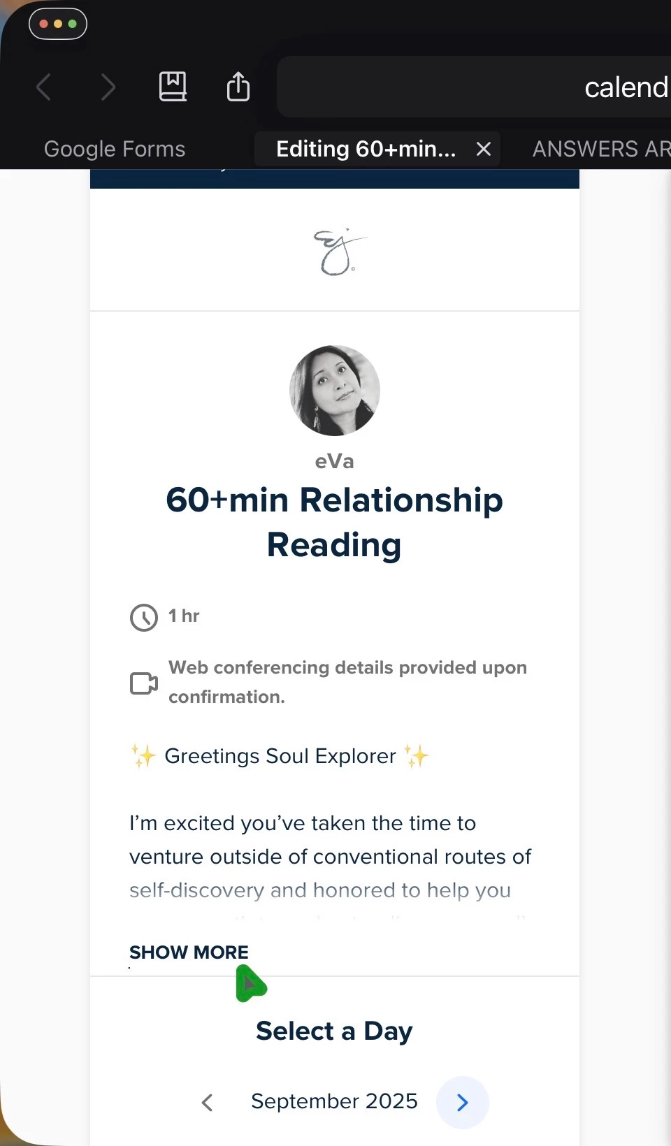
Hi @eVa16835,
Ah, interesting perspective. I can definitely see the scroll bar making a lot of sense on the web/desktop version of Calendly as it’s easier to get around. Do you feel the same for mobile (assuming that’s the second screenshot)? I think the goal was to avoid people feeling as if they needed to scroll and scroll to get to the ‘Select a Day’.
Love the feedback and will definitely pass it along to Product!
Thanks for your prompt reply Jillian!
I use the desktop browser page on my iPad and the app on my phone and feel the same for both. I can understand the intent to get to the calendar faster- maybe this can be an option to turn on/off per user’s preference? In my case, details I include in each event description is important for client’s to know before choosing a date.
Happy to test out any added features for the Product team!